Sharing changes, visuals first
Over the past year, I’ve shared much of my work at Arkio internally through so-called “release comics”. Here are some examples:
Examples of release comics I’ve shared within Arkio.
These release comics have been an effective medium for communicating changes. Their visual nature makes them really easy to understand at a glance.

The feedback I’ve gotten has been very positive.
In this post, I’ll explore this visual-first approach to sharing changes and discuss what makes it so effective. There’ll definitely be some ideas for you to take and apply to your own communication!
Prior state
To effectively evaluate and reason about a new feature, or a change to an existing one, you’d need to understand what motivated the addition of the feature in the first place. Was it added to work around some problem, or does it make some process more efficient? It helps to know.
So when communicating a change, present the state of affairs prior to your change. If you’re restructuring a key workflow, explain why the workflow exists and what wasn’t working about it before. It gives the audience a framework to reason about your changes.
In the release comics, I often present the prior state — and contrast it to the current state — via a before-after comparison.
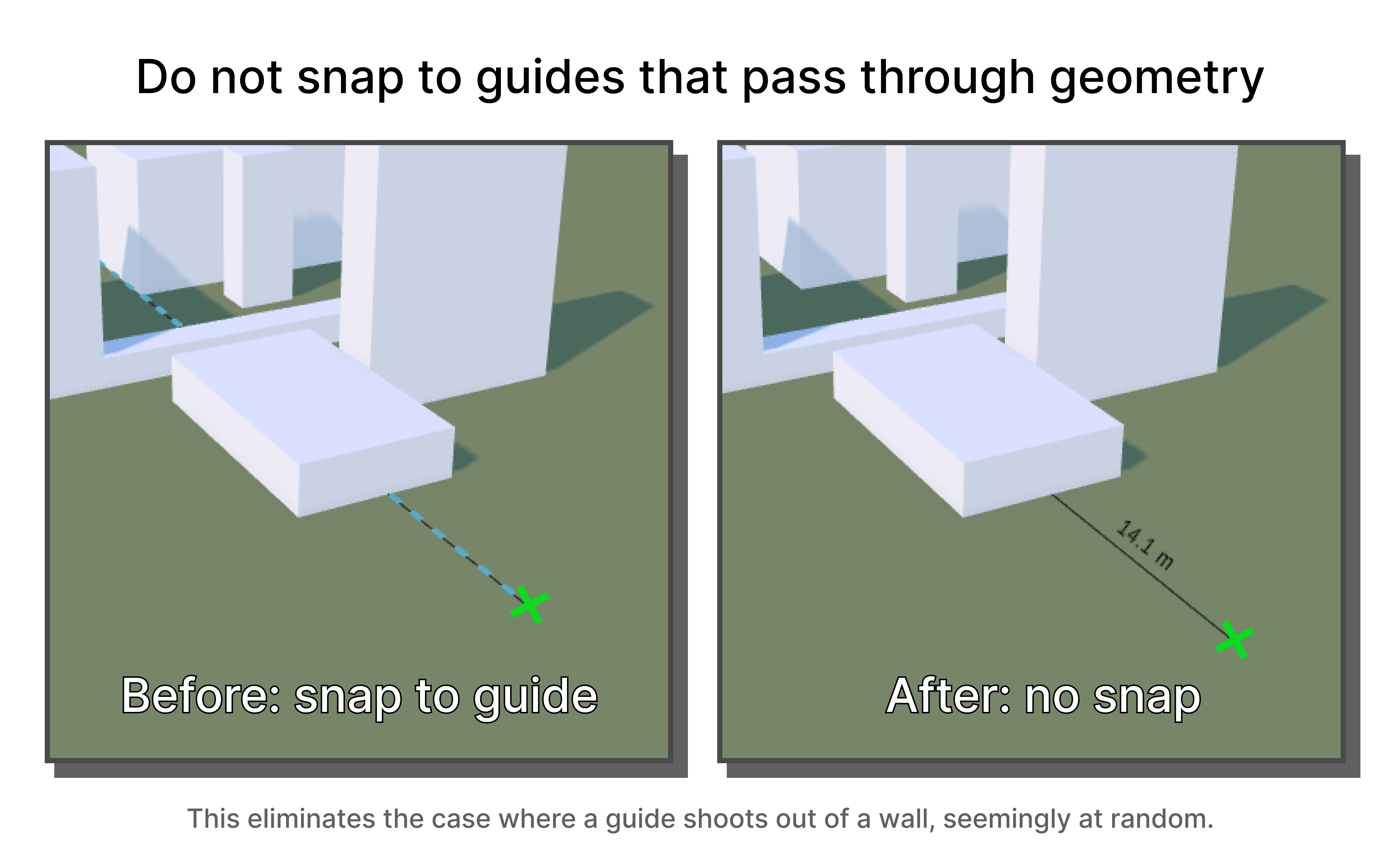
I love using before-after comparisons — they’re such a simple model for communicating change.
Here’s how the thing didn’t work.
Here it is now, working!
Although the contrast is effective, before-after images don’t always provide enough context on their own. For that reason I usually share a short text description alongside the images, providing context and clarifying the scope of the change.
Still, the visuals are key. They make the context easier to grasp, so less text is needed. Glancing at an image is far more effortless than reading a text description.
Introducing new behavior
A before-after comparison is an obvious fit when changing existing behavior, and it can also be used to effectively present new behavior. Take the example below, which shows the addition of guide alignment under specific circumstances.
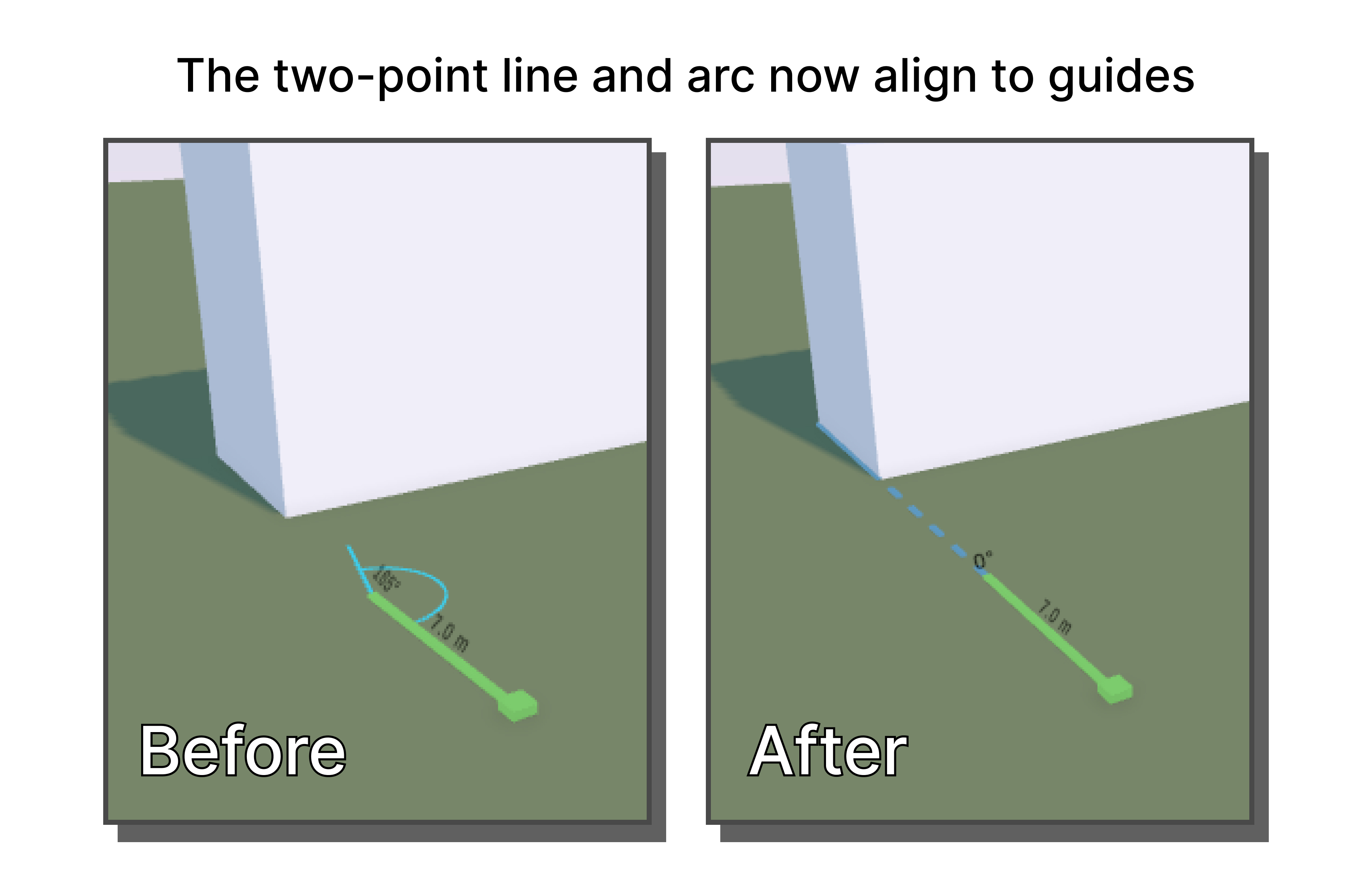
The prior image shows the user experience without the feature (guide alignment). Without guides, the user can try his best to align to the geometry, but will usually be slightly off. Quite frustrating.
The after image then shows how guides make aligning to existing geometry a breeze. When contrasted to the prior state, the value of the new behavior is easily understood.
Show, don’t tell
A few months after joining, I profiled editing in Arkio and noticed that calculating three-plane intersections constituted around 52% of the time spent when editing large geometries (geometry in Arkio is defined by planes and their intersections). Implementing the fast algorithm for three-plane intersections from Real-Time Collision Detection (chapter 5.4.5) resulted in those calculations becoming ~500% faster, which resulted in editing becoming ~72% faster.
One way of sharing the change would be to just state the raw numbers. Telling people that the change improves edit performance by ~72% certainly sounds technically impressive.
But what does that mean for users? Does the performance improvement translate to a better user experience?
To make the change palpable, I recorded a before/after video showing how the change nearly doubled the framerate when editing large objects.
Look at how much smoother the ‘After’ experience is!
I did share the numbers alongside the video, but without the video demonstrating the impact the numbers would have felt abstract.
Use multiple examples
Earlier this year I made a fairly simple change which was to scale measurement labels down when they were too large to fit the line that they describing (and fully hiding them when too small). It produced useful results in an array of circumstances, so I created multiple pictures to demonstrate:
The takeaway is fairly simple — if you’re presenting a change that is useful in multiple circumstances, demonstrate that using multiple distinct examples.
Annotations & illustrations
Last summer, I spent some weeks improving Arkio’s guide system. A big part of that work was reducing false-positive guides, i.e. not providing guides that are unhelpful.
One of the concrete changes I made was to disable guides whose origins are occluded. A person reading a description of that change — “Disabled guides whose origin is occluded.” — would reasonably ask what the “origin of a guide” is and what it means for it to be occluded. So when sharing that change, I illustrated the idea:
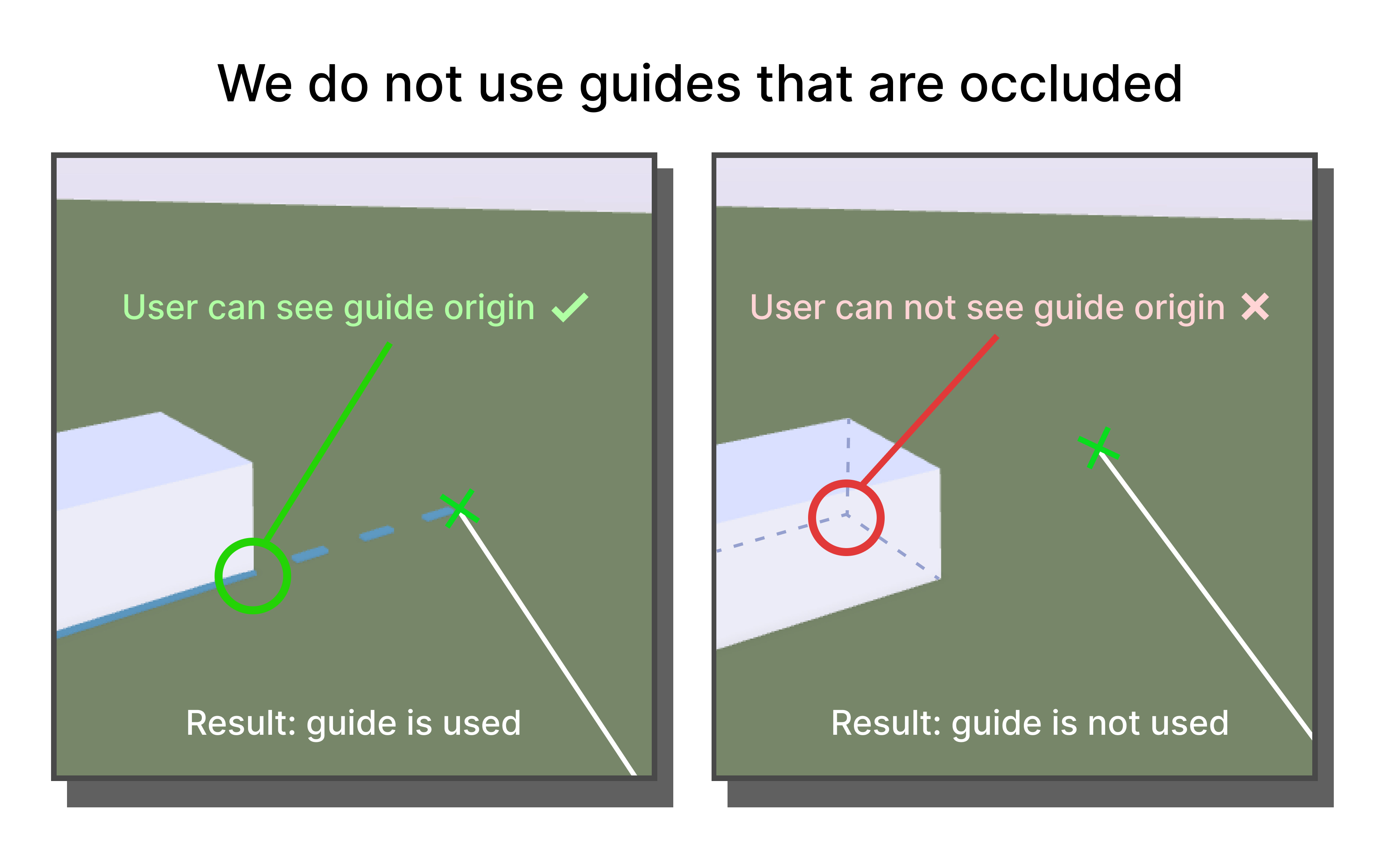
I think this quick and simple annotated image demonstrates the idea more efficiently than any text description can.
Using real screenshots is preferable, but those screenshots often benefit from augmentation — adding annotations to highlight areas, or diagrams to demonstrate an idea. Here are some more examples from my work on the guide system:
I frequently use annotations for emphasis. The annotations in the example below are not necessary to understand the idea, but they help emphasize it and make it incredibly effortless to understand.
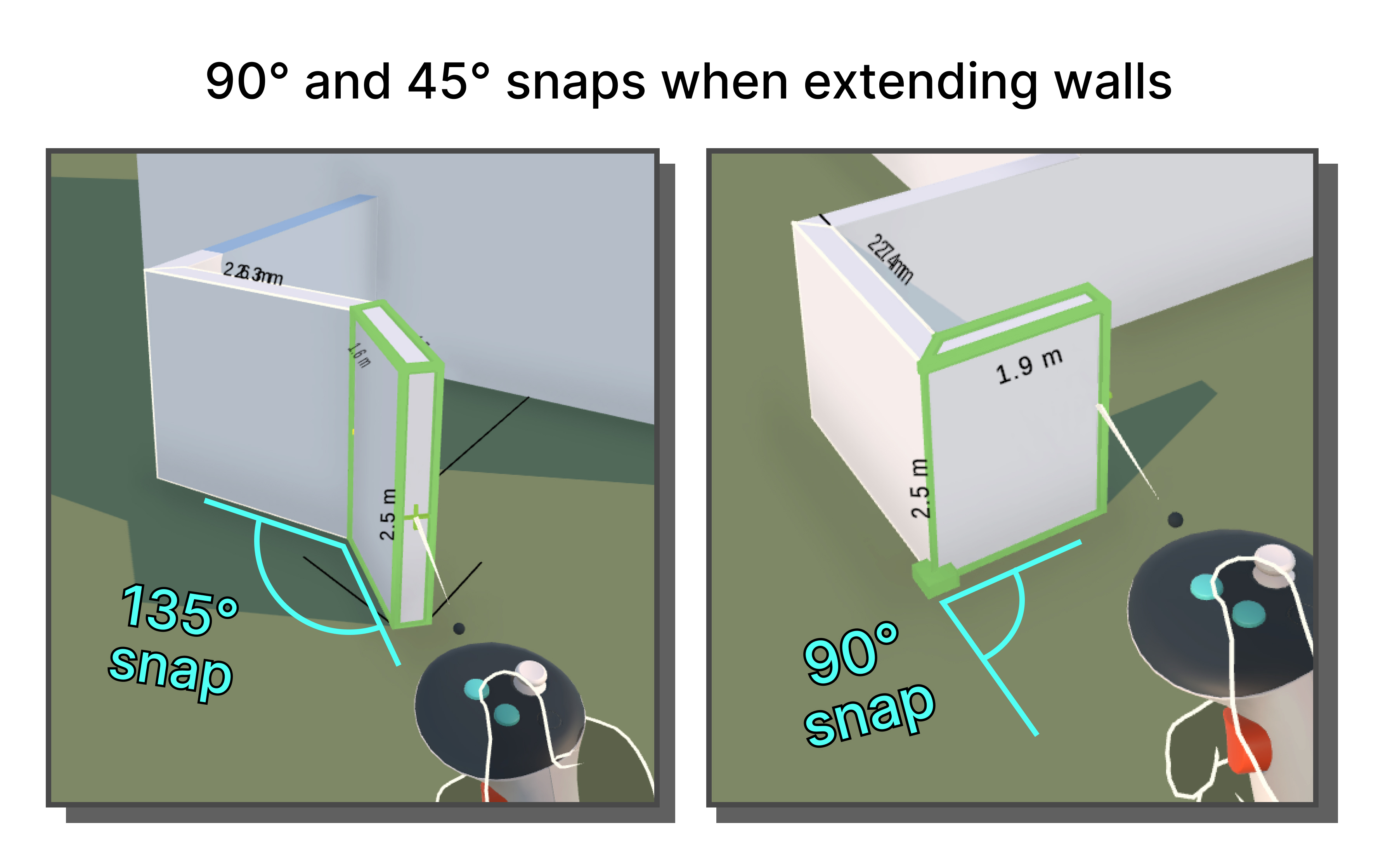
These visuals make the changes immediately understood at a glance, whereas textual descriptions require more effort from readers. Most people will not need a deep technical understanding of your changes — they’ll appreciate being able to take a cursory glance at an image to get the general idea.
Actions
I represent actions by connecting the start and end states using an arrow. Here I contrast two start states and their respective end states using arrows:
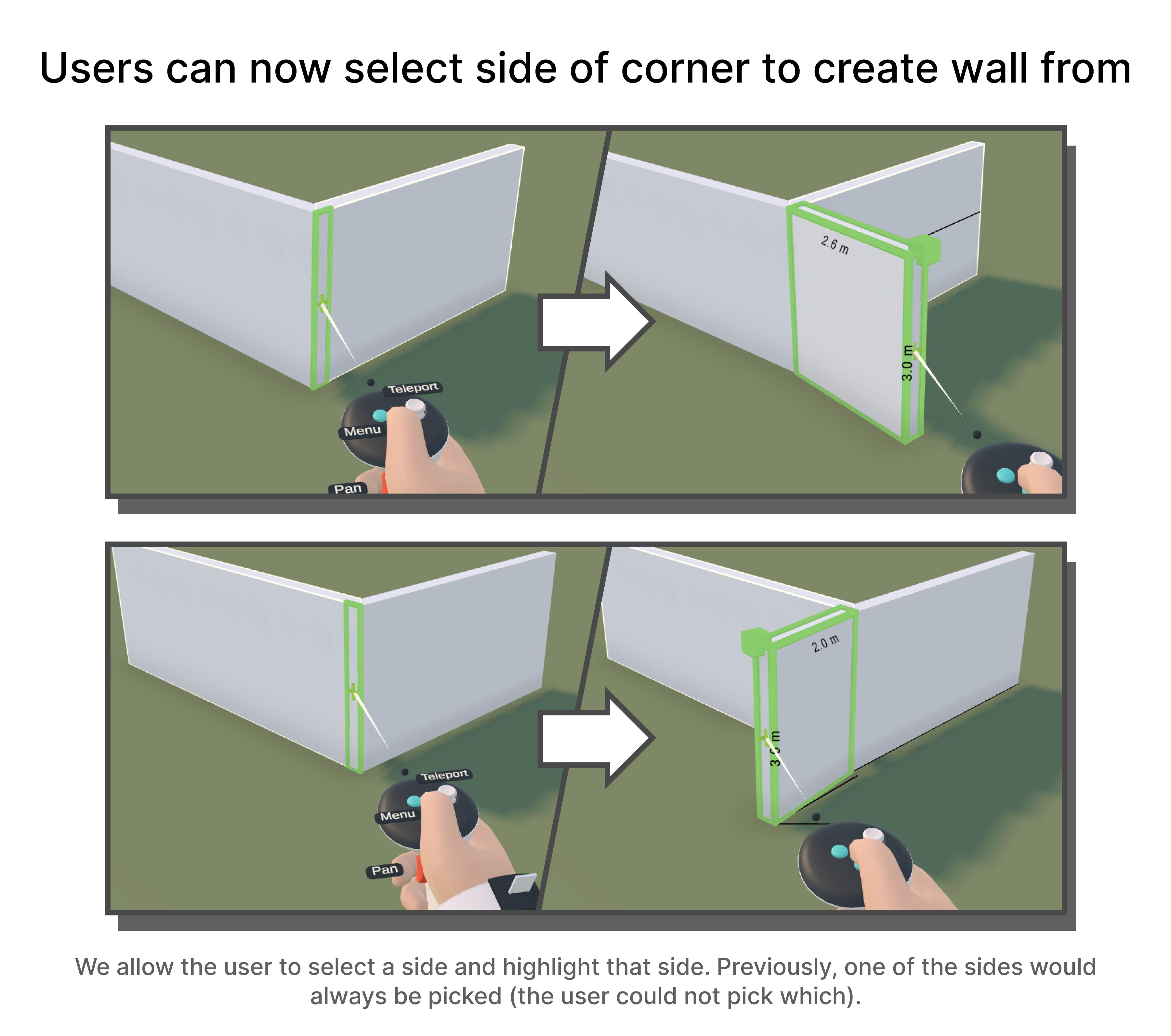
I frequently pair actions with before-after comparisons. Here are some examples of before-after actions from my work on the wall tool for Arkio’s 2.0 release:
This is just one way to represent actions, but it’s worked quite well for me!
Other mediums
This “release comic” idea is tailored to a distributed working culture. However, many of the ideas at work translate well to other forms of communication, like my favorite, live demos!
In live demos, I find that presenters sometimes spend far too little time (if any) explaining the prior state, or explaining the context of what they’re presenting. When presenters go straight to showing off exactly how the thing they built works, it can leave the audience lost.
Side note: as an audience member, even if you have the full context, it can be helpful to ask prodding questions like “Under what circumstances would this be used?”. Getting the presenter to provide context is useful for everyone involved, and makes any post-demo discussions much more productive.
I also think that people should use far more annotations and diagrams than they currently do, whether in design documents or traditional presentations. Less text, more visuals! — They make absorbing ideas so much easier.
Final words
I’m hoping that me writing this will influence some people out there to take a more visual-first approach to communication.
I’ve found the release comics to aid other people’s understanding of my work, and the changes I’m making. They’re quick and fun to make, save other people effort, and they act as a very portable artifact for a piece of work!
Sharing changes visually will fit some projects and roles better than others. Still, see if you don’t find an opportunity to present your work visually!
— Alex Harri
To be notified of new posts, subscribe to my mailing list.